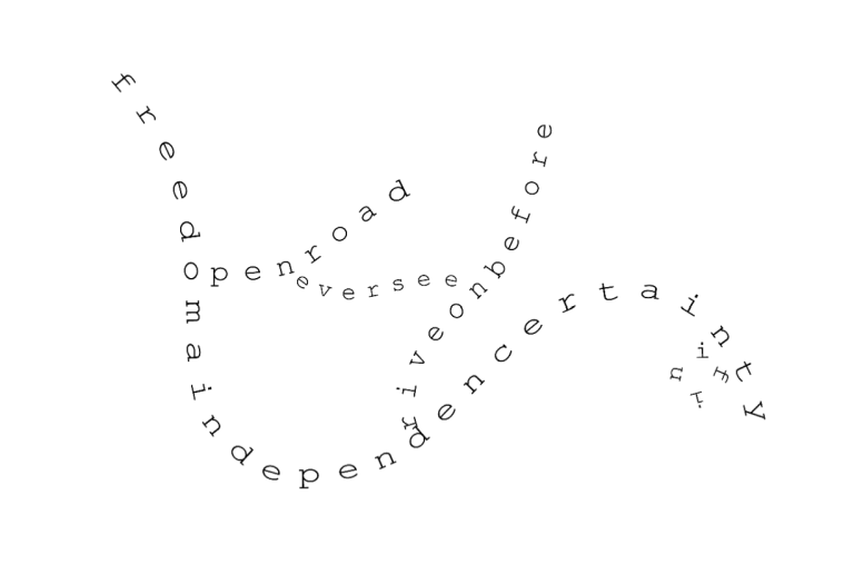
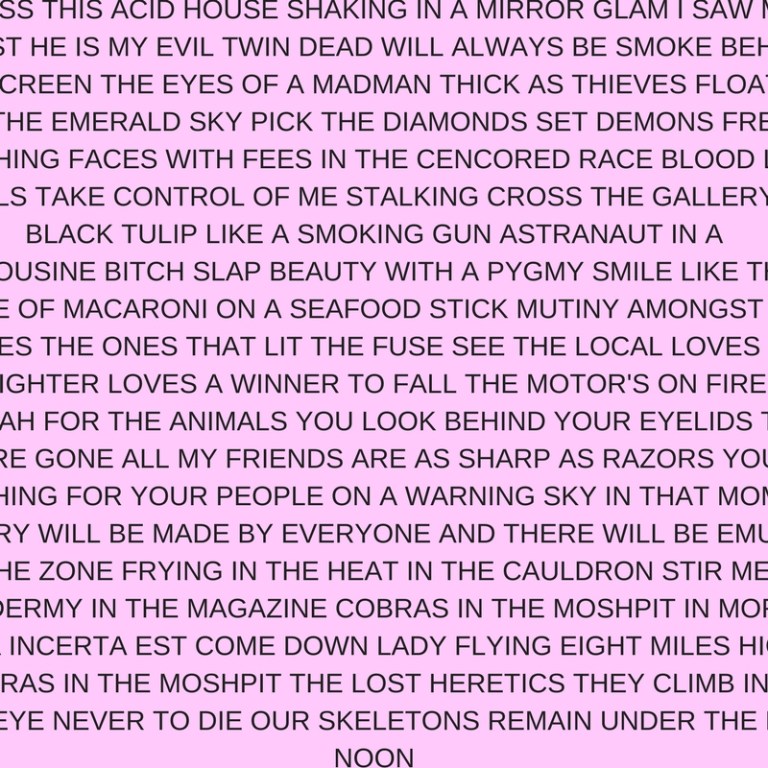
This work is based on the lyrics of the songs written by Sergio Pizzorno, one of the frontmen of aBritish band Kasabian. The name is what one of the band’s singles Velociraptor (2012) starts with. The songs were picked randomly, from all the six albums the band released. The focus was on the expressiveness of the word combinations in lyrics, the rhythm, the alliterations in words used. Once the word combinations were picked, they were organized in a text which was bigger than the space it was placed so that the reader doesn’t see some words and expressions. It is not evident whether the large or small parts are emitted so that the text visually seems infinite on the sides. At the same time it ends with one word on the last line which questions its size.
The last couple of formal visual features of the text that draw attention of the viewer and reader is connected with the band’s work on their album designs. Kasabian always contributed their vision greatly on the artwork of each of their album even if the design was done by artists they invited. The concept of an artwork aimed to broadcast the main ideas of the songs and what the band wanted to say by the record.
In Blast Off the visual features of two last albums were used: the color of the background space and the font Helvetica. These two elements were explained by Kasabian’s Art director Aitor Throup as very simple, laconic, although revealing things. The font was used in the 48:13 album as something minimalistic, but hence direct as the music and the title of the record (48:13 is a duration of the songs on the album) themselves.
The color was something from 48:13 and Kasabian’s sixth and latest album, For Crying Out Loud. 48:13 looked as simple as possible: the numbers were put in Helvetica on a neon-pink background. That looked rebellious and memorable: “Pink is the antithesis in color standards” – said Aitor Throup describing the artwork. However, in the design for the last album’s booklet, Throup used pink color again for lyrics page, but this time it was a pastel pink, without any notions of kitsch or dare. This color was used in the Blast Off as a signification of the connection of the two artwork concepts and the homage at the same time.
Going back to the text of the work, it places some questions before the reader: what the sizes of the text are, how many words are unseen and whether they are adding some new context to the other expressions readable, if there is a narrative to it and whether those chosen word combinations are revealing something about the author or about the band’s work. The answer to the last one is connected with the method of making the text of the piece presented. Citation of the expressions from the lyrics is taking them out of the context of each song while creating a new kind of narrative or, at least, expressiveness. This juxtaposition of the word combinations may seem random and probably, it’s the best approach to see them, but anyway it comprises the original text which leaves the music behind completely. That brings the text some of its original features – to verbalize ideas and to be read, and it’s created by breaking the its connection with music. caption


Twisted colours he ones who’s not оставляясь в тени знаменитых коллег word street spam
Video art seemed to become a 3d reality within reality. when you go down the stairs it’s like you’re diving into mind of human. the body theme that correlates with inner world of a person, and street video that reminds you about imperfections of society.
Unlinear space of speaking things intervention.